Wednesday, 26 October 2016

Sight and Sound Review Page Structure Analysis

The following image shows an example of a typical double page spread of reviews in a Sight and Sound magazine. I made some notes below regarding the page architecture, page elements, and stylistic features.

Page architecture
There is clear grid structure that clearly divides the different reviews, as well as the pictures and the synopses with credits. There are margins that go across the top to separate the title and main information from the blocks of writing. Viewers will be able to easily identify which review they are reading, along with the main information for the film, such as the country, the year, the director, age certificate and the run time. Furthermore, the page is split into three columns, which fits enough writing so that a single line isn't too short or too long to be able to read easily. Each review spans roughly three columns, and so the three column structure is useful in terms of accessibility and clarity. In the cases of cast and crew credits, three smaller columns are used within one regular column to keep the grid effect and three column structure consistent. Graphics are often included at least once for each review, and fit into the grid structure by lining up with the dimensions of the first, second, or third column, depending on how big it is.

Page elements
In a typical review page, there is includes the title of the film with basic information, followed by the main bulk of the review. At least one graphic is also included, which may take any place on the page as long as it fits in with the divided grid style of the overall page. To accompany each graphic, there is always a caption that anchors a tagline or a meaning to the image, and vice versa. Followed by the review and its imagery, is the credits and synopsis section, which gives a brief summary of the film and states the full cast and crew credits. 

Stylistic Features
Despite the overall lack of colour, the hints of red ensure that the review pages are clearly coded and are made easy to differentiate from the other sections of the magazine, as its main purpose isn't just to review, but also to cover other film related topics. The credits and the synopsis are also colour coded in red, as they share the same page as the reviews. However, this section of the page is placed onto a grey background, to keep the minimal colour palette consistent, but also makes it easier to read and see that it is a different writing style to the review. The editor of the magazine has chosen the title of the film being reviewed to be larger and bolder than the main body of the text. Also in bold, is the name of the reviewer, and further down in the credits columns, the job titles of each person being credited. The synopsis itself also shows a difference in darkness and boldness compared to the review. The writing is fairly small to fit all of the elements across roughly one page, with the title being larger and the credits being smaller in size. The font is fairly basic in order to be accessible, and it remains consistent throughout the different pieces of writing within the page.

Synopsis
The synopses featured within Sight & Sound are often concise, as they are not the main element of the page, yet explain clearly the narrative of the film. As this is a review for a feature film, the events within the narrative are condensed to just a sentence. Overall, the language used is fairly easy to understand, with fairly accessible language which still clearly portrays the nature of the film. 
Compared with the synopsis that I have begun to draft, it is a lot less detailed, with less evidence of WYSIWYG, especially in the case of reference to specific technical codes. Furthermore, there is more focus on more characters considering that feature can afford to. 

Tuesday, 25 October 2016

A Comparison of Short Film Posters with Feature Film Posters

Whilst analysing both feature film posters, and that of short films, I recognised some conventions of each, and how the two types of films made their posters similarly and differently. 

I noticed that in the imagery of a feature film, the stills used for the poster often feature wider shots which create a larger amount of negative space for text. This may create more of a scene or perhaps introduce more characters to the narrative than the conventional short poster, which usually features closeups as opposed to wider, longer shots which establish the nature of the film a little more. The short films challenge this convention of leaving vast amounts of negative space, usually with just solid colour, and instead use a still image that comes in the format of a closeup that fills more space than what is needed for the text in the space. Therefore, the text found on a short film poster is conventionally superimposed on top of the main image, compared to a feature, in which there is a solid area of negative space to place the text. 

A further convention I identified within the short film poster that differed to the feature film poster was the billing block. Traditionally, the billing block for a feature film poster features the same or similar compressed text in order to fit the credits for the main cast and crew onto the front. This is usually hard to read from even a fairly close distance, and therefore doesn't allow the creators a lot of credit on the poster. On the other hand, I recognised that some short film posters subvert the convention of using a commonly used, compressed font, and instead remain consistent in the font they are using throughout. Usually these fonts are more spaced out and are larger, perhaps to show higher respect for the cast and crew by giving them a credit that is easier to read, which therefore raises recognition of their work.

I noticed also, that feature film posters often include a more clear and vibrant colour palette as a part of their list of conventions. It tends to vary a bit more than short films, which usually keep to a neutral colour scheme where the colours do not vary and contrast quite so much. This may perhaps be because of the profit involved in feature films, and the potential they have to entice an audience through an eye catching poster. Meanwhile, short films don't earn quite so much money, and perhaps only seek to attract audiences that are educated and media literate, and so quite often look past the aesthetic choices of a poster, and instead more towards the information. It is also likely that short and feature film posters both differ in what their main purpose is and where they are likely to be found. For example, the feature film posters I analysed are mainly landscape and therefore suit a billboard more than a magazine, whilst the short film posters I analysed are mainly portrait in page orientation, which may suggest a magazine, or an electronic press kit ready for the film's release.

Overall, there are many shared conventions between film posters, although the difference in the feature film and short film formats comes with differences in the conventions used by each type of film's poster. 

Monday, 24 October 2016

Short Poster Analysis: Smafuglar/Two Birds (2008)


The first feature that is seen as a part of this film poster is the closeup over the shoulder shot of the boy. The amount of space left around him, especially as he is within close proximity to the girl, may imply themes of entrapment and/or protection and innocence. The overall colour scheme is quite pale and neutral, which may further support the implication of themes surround purity and innocence. The large amount of skin tone seen throughout the poster might suggest coming of age issues and themes also, especially as the two characters are pictured within close proximity. Already from the poster, the reader may be able to tell the protagonist as the shallow focus excludes the girl and draws focus towards the male character instead. It may also be interpreted through the similarity in appearance of both characters, that it is a reflection in a mirror. This might support Lacan's mirror stage theory of the child becoming aware of their appearance, thus connoting further issues surrounding coming of age. From the poster alone, the reader may be able to infer that the producer has chosen to represent age and perhaps sexuality and gender, through the characters, issues and themes that are implied through the image.

The poster leaves some negative space, in which feature film posters usually use to place text. This example uses the girl's shoulder, in which there is a solid background which allows the information about the film to be seen without the overall page looking cluttered. Furthermore, there is a border left around the edge of the image, in which there is no text or other graphics. This almost detaches the audience from the moment captured by the still, allowing them to look at it and attach different meaning to it, perhaps in a nostalgic sense, as it almost looks like a framed photograph.

The varying sizes and colouring of the text implies a hierarchy or an order in which the reader is likely to consume. The title is the largest and takes up the entire width of the image, and touches the border, so that it looks like it has been cut off, as it is the same colour. This may emphasise the closeup of the boy in the image, and serves a purpose to support the themes connoted earlier on by the image, of incarceration and/or protection. The title is the palest colour, which might imply innocence as well. The director's credit is the next largest and is grey in colour. This contrasts to the white title, and gives those who know the director by their name a reason for wanting to see the film. This might suggest that short film directors are interested in being recognised for their name, style and work as a collective as opposed to one well known text. The smallest writing in the poster is that of he billing block. It is unconventional because it challenges the stereotypical billing block used in feature film posters, in that the font used is larger and more spaced out. This possibly holds the purpose of giving the cast and crew a bigger credit as a whole, as it is easier to read and recognise amongst the other writing.

Considering what is placed on the poster helps to identify the context it which it was created. The absence of a tag line might prompt readers to ask questions about the narrative. Meanwhile, the lack of film festival laurel leaves suggests that the poster was used whilst attending such events, as a first release of the poster. Therefore, it may have been included in the electronic press kit for the release of the film overall. Furthermore, the dimensions suggest a portrait orientation within a magazine, or perhaps on a wall as an advertisement, or poster spaces that cater for portrait dimensions, such as at a bus stop.

Sunday, 23 October 2016

Short Poster Analysis: Slap (2014)


The medium shot of the male character serves as the main basis of the poster. This takes up the largest area of the poster and therefore suggests that the character is very important to the narrative. The medium shot has perhaps been used instead of a closer one in order to show the props and to hint at the issues and themes to come with the narrative. The main colour of the image is very dull and grey, which suggests the protagonist's view on his life. He is carrying out a stereotypically masculine sport, as suggested by the mise en scene of boxing gloves. The composition of the frame and the body language almost suggests discomfort in the character, as his arms are bent, which suggests there is not much room to move. This might connote themes surrounding that of entrapment. The colour scheme is almost broken up a little by the bright pink writing, which distracts from the image, yet creates an association between the title and the imagery. Pink connotes femininity and may therefore suggest issues and themes that challenge sexuality and/or gender, considering that the protagonist is a male portrayed as being masculine.

The shallow focus of the background in the shot creates some negative space, although it is not a solid colour and therefore may still need to be seen to add to the meaning of the poster. Some of it has been filled by laurel leaves and for a small line of credits. The rest has been superimposed on top of the lower half of the male character, which still allows the reader to see the main aspects of the image. It may be a convention to short film posters that there is less negative space left by an image compared their feature film counterparts.

The text placed on the poster varies in font, colour and size, which suggests the order and importance of what the reader is consuming. The largest and most eye catching text within the image is certainly the pink title, which makes the poster successful in creating communication between the name of the film and the image in which it is superimposed on top of. The only other element of text on the image is the credits, which are conventional in the way that the font is compressed in order to fit as many in as possible, and is hard to read at a distance. This is kept with the dull colour scheme as it is white in colour. Also on this poster is a row of laurel leaves, which suggests that the film has been to several film festivals and made it to the official selection for some, which,with the absence of star ratings and reviews, may reassure the audience that the film is somewhat successful and is appreciated by others. The absence of star ratings and reviews as mentioned by intermedial companies may be a convention of short film posters, as short films are less often reviewed by magazines and newspapers.

The actual font used for the title carries the effect of a scratched paint texture. This may connote an aggressive action, which further communicates and associates with the image. Furthermore, the title is Slap, which implies anger and/or violence. It is an onomatopoeic word which further connotes a narrative surrounding conflict. However, the word choice and colour suggests femininity and an implication of binary opposition. 

Considering what is placed on the poster helps to identify the context it which it was created. The hints towards attending film festivals not only suggests that the film is successful, but also that it has been circulating such events since being released, and therefore that this is likely to be a newer version of the film poster. Furthermore, the dimensions suggest a portrait view within a magazine, or perhaps on a wall as an advertisement, or poster spaces that cater for portrait dimensions, such as at a bus stop.

Saturday, 22 October 2016

Short Film Poster Analysis: This is Vanity (2013)


The close up of the woman on the poster is the first thing to be seen as a whole. This definitely suggests that her character is perhaps the most important to the narrative. Furthermore, it exaggerates her facial expression, which looks worried, and gives little space around the edge of the poster. This, therefore, is successful in hinting at issues and themes, particularly that or entrapment/incarceration, and perhaps also mental health given the woman's facial expression and the mood set in the poster by the cool, melancholic colour palette.

There is almost a lack of shape within the image itself, as the woman is close up, and the image looks to have been taken whilst playing around with focus and objects close to lens of the camera. This creates a sort of blurred image, which might further connote the issue of mental health and therefore representing ability/disability by suggesting the protagonist's ability to see and/or think clearly. The still for the poster doesn't leave much negative space, which may be a convention that sets it apart from a feature film poster.

The text placed on the poster is fairly minimal, with it all being centred on the page, with plenty of space between each line. The colours used stand out from the image, yet continue to add to the lugubrious colour theme. The text that is the easiest to spot is the title, which is the largest and is in the centre. Therefore, this makes the poster successful in anchoring the name of the film to an image, giving the audience something visual to associate with the title. Meanwhile, there is evidence of a tag line, which raises questions about the content of the film, thus drawing in an audience. Furthermore, there is likely to be audiences interested in the film based on the claim that it has made it to the official selection at film festivals, as suggested by the laurel leaves below the tag line. This is an example of an intermedial reference, as it mentions different media-related events in which media literate people would be able to recognise. These are fairly large compared to the rest of the text, which may suggest the poster's aim in showing its success. However, there is an absence of reviews and references to intermedial companies, and so this may not be the main aim. There are four larger credits at the top, and a credits block at the bottom. This poster challenges the traditional feature film poster conventions in the credits block, as it does not use the stereotypical font, which looks crammed and is barely easy to read unless standing very close. Instead, the poster uses the same type of font as the rest of the poster, with regular spacing between each letter an word, which provides an easier to read block of writing, and therefore provides mainly the crew, with a bigger credit than what is typical. This helps to make the poster look neater and adds to the minimalism in the continued use of the same font. The font is a basic san serif typeface that further adds to the simple look of the poster.

Considering what is placed on the poster helps to identify the context it which it was created. The hints towards attending film festivals not only suggests that the film is successful, but also that it has been circulating such events since being released, and therefore that this is likely to be a newer version of the film poster. Furthermore, the dimensions suggest a portrait view within a magazine, or perhaps on a wall as an advertisement, or poster spaces that cater for portrait dimensions, such as at a bus stop.

Friday, 21 October 2016

Synopsis Research Survey

To evaluate and help decide out of the three synopses, which one to continue with, I created a survey to carry out by asking my media literate peers what their views were. I have asked several questions based on Milgrom's theory, and overall which was their favourite. This may help in narrowing down which synopsis I decide to continue with. The questions I have asked are as follows:


Monday, 17 October 2016

An Introduction to Sight and Sound and its Reviews

Sight and Sound belongs to the BFI, and is a monthly publication that covers all UK releases of that month, despite the extent to which they are released.
The review is meant to enthuse the reader- persuasive writing is used.
They are kept short, the pages offers a review, full cast and crew credits, essential film information and a synopsis.
There are parts of the magazine that are intensely academic, however, it covers every UK release that falls within in the time period, whether it is arthouse or mainstream.
It mentions events, including festivals, in detail with write-ups, reviews and appraisals. These are events in which dedicated fans, students and academics are likely to visit. It covers all major art festivals, as opposed to just the main ones.
Feature articles include a variance of film topics.

Saturday, 15 October 2016

Feature Poster Analysis: The Selfish Giant (2013)


The two most predominant features of this poster are the title text and the image of the boy with the horse. This may be successful in portraying the name of the film, and giving it imagery to associate with it.  Intertextuality is seen here in the title, as it is a reference to an Oscar Wilde story of the same name. This may suggest that the short story serves as a basis for the film. The red writing stands out against the neutral grey background. This colour connotes danger, which may suggest some themes and events in the narrative. The grey may also represent a dull and boring background in which the protagonist has emerged from. Overall, the colour palette is quite cool and therefore suggests a more melancholy mood to the film. Meanwhile, the protagonist is portrayed with a horse in this version of the poster. The choice of subject matter might suggest a setting within a rural area, or that of a working class nature. The clothes that the boy is wearing further supports this suggested connotation as they are casual and therefore suggest working class representation.

The shapes in this poster serve for negative space all around the superimposed image of the boy and horse. This means that there is room for all of the text around them, as well as one extra added graphic of the electricity pylons behind the title. This hints at events in the narrative as they are an important part to the story, as well as to the setting. 

The title of the film is most definitely implied to be the most important piece of text on the poster, as it is the largest and most brightly coloured out of the whole composition. The text that follows within the clear hierarchy created, is the star ratings along with their reviews. There is one that fills the width of the poster, with two smaller ones underneath. These are easily accessible for all types of media audiences, and so creates a higher chance of more mainstream audiences seeing this film. Along with the reviews and ratings at the top, there are also more ratings below, which may emphasise the positive feedback that the film has received from the mentioned inter medial companies that reviewed it. Following this is the director credit, which appeals to only those who know the director by name, instead of by film name. This may only appeal to the more media literate and appreciative, as they are likely to analyse a poster for longer than the average audience member, and recognise a director by their name without reference to their previous films. Finally, and conventionally, the credits in the bottom of the poster are the smallest and less easy to see.

The font itself is a basic san serif typeface, which might emphasise the issues and themes surrounding working class representations, and lack of opportunities for such social groups.

There isn't a tag line for this poster, which may suggest the context of it. Considering the dimensions of the poster, this may have been designed with the purpose of advertising the film on billboards or similar, as it would only fill up half a page, or sideways within a film magazine like Sight & Sound. 

Friday, 14 October 2016

Feature Poster Analysis: Somers Town (2008)


The first feature of the poster that is noticed is the striking yellow text against the black and white format of the image. The colour yellow carries connotations of happiness and joy, whilst black and white may prompt a more emotional response. The lack of colour might connote a lack of something within the film, in a figurative sense, or to strip down and take away things from the image that might interfere with the directors intended message. The yellow on the grey background might imply that the protagonists begin with a dull scenario, and throughout the narrative, find something that makes them happier. Meanwhile, the mise en scene within the poster, specifically costume and location strongly suggests issues and themes surrounding the working class and poverty. 

The shapes in the poster allow for positive space to fill the bottom half, whilst there is negative space left for text and graphics in the upper half. The main focus of the two characters are shown at the front, whilst their background is shown in shallow focus. This might imply that the characters are breaking away from their background, and not letting it restrict them. This may suggest themes of determination and perhaps youth activity, as the boy has a camera around his neck, therefore hinting at a hobby.

Whilst leaving the photograph the main aspect of the poster, the text fills the negative space which is the sky above the flats in the background. This works well as it has almost been designated to text from when the still was taken, which shows thought being put into what was going to be written. Other than the title, the text matches the monochromatic colour palette of the photo, which allows the title to be effective in clearly being identified as the name of the film, and easy to associate with the image. It  seems the same or a similar font has been used throughout all of the text, although there is a mixture of upper and lower case and wording of different sizes. This definitely suggests a hierarchy and the statements in which the producers of the poster would want the consumers to read the most. The director has been recognised for his other film, which has been referenced, which shows example of intertextuality. Along with the credits from intermedial companies, these are the largest pieces of text on the poster following the title. This might suggest that the producers want to draw in an audience that is likely to recognise the director from his previous work as opposed to his name, which is shown in smaller font, or those that like to watch based off of others opinions. Meanwhile, the billing block and the references to film festivals are much smaller, which helps in making the poster look cleaner and neater. The laurel leaves suggest that this is a further release of a poster, after attending several festivals and being nominated for awards. 

The font itself is a basic sans serif typeface, which might lend itself to the connotation that the characters lead quite dull, basic lives.

The reviews and the star ratings are a conventional feature of a film poster, in which even less media literate audiences will understand and will be able to access. The adjectives used are also quite accessible to those of a younger reading age, which immediately gives the consumers the influence of a shared positive viewpoint amongst the intermedial companies mentioned below in a smaller font.

There is no tagline for this poster, which might suggest the context. It raises more questions about the content of the film considering there is no hints given. This poster has already suggested that it was making its rounds of various film festivals, and has been rereleased. Considering the dimensions of the poster, this may have been used as a traditional poster to advertise on billboards or similar, as it would only fill up half a page, or sideways in print format.

Thursday, 13 October 2016

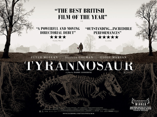
Feature Poster Analysis: Tyrannosaur (2011)


The main focus of the poster is the illustration, which predominantly shows a dinosaur buried underground. Above it, is a man holding some sort of weapon. Connotations carried might include history, past issues resurfacing and death, as well as violence and destruction. The variance of colours is low, with a neutral colour palette being used. Deeper colours, particularly brown, may be associated with cold and dark connotations. This might further support the suggested issue of death, and set up a bleak mood for the film. 

The divided shape to the poster that has used in this poster two divide the living and the dead might suggest binary opposition within the film. It also carries the aforementioned connotations in a simple, yet contrasting way.

The text for the poster fills the negative spaces left by the illustration, especially with the reviews, as they formulate a triangle shape around the houses and trees. This shows that thought has been given to leaving enough room for the other conventions needed for it. The title takes up the largest part of the poster, going across the middle, making it clear in its aim to present the film to the audience. A similar font is used for the reviews and the credits, which makes the poster look neater and less cluttered, also in the way that similar colours have been used to match the illustration in the background, keeping in the same colour palette. Meanwhile, intermedial reference is made in the laurel leaf image in the bottom right hand corner, in that the poster has been created to show that it has won an award at the Sundance Film Festival. Also in the bottom is the billing block, which cannot be read clearly by just looking at the poster at this size, which is a positive aspect of the poster, because it emphasises the larger credits, such as the actors and director.

The font itself is fairly basic in that a similar serif typeface might be found on several computer programmes as one of the default fonts. This however, might be effective in creating a more serious tone to the film's poster, and therefore maintaining the correct mood considering the content.

The reviews use a dark, and bold font to clearly state the thoughts of several different magazines and newspaper film reviewers. The mention of the media text it has come from employs a wider media context for the audience to understand. The star ratings are displayed, which is a common convention of posters, and is easy to read for all types of audience, as a simple 'out-of-five' mark gives a good idea of general opinion of the film. The star rating for the top review has not been included, but instead has been made bigger and bolder than the other two. The adjective 'best' used in the review might suggest the highest rating for it, and also gives the poster an easy to read quote to place at the top of their reviews, possibly to draw in an audience. 

There is a tag line missing from the poster, which might suggest the context of it. It also includes the festival award laurel leaves, and so it might imply that this is not the first version of the poster, and that it has circulated several festivals before re-releasing another poster specifying its accomplishments. Given the dimensions of this poster, it looks as if it was designed for a billboard or other types of wall hanging or advertisement, as opposed to a page in a magazine for example. 

Wednesday, 12 October 2016

Synopsis Draft Two

Upon my feedback session, I was told some positives and some point to improve on from my first draft of the synopsis. My tutor told me that according to Milgrom's theory, I needed to make my problem clearer, and increase the stakes. 

I agreed to stay with the initial set up of the girl running out of her classroom into a crowd of parents, although I have now edited the rest to set the story up without the mother figure being there. I thought of several diverse scenarios in which the girl runs out in order to find her, to see that she has not turned up:

  1. The girl attempts to walk home by herself, seeing several different social issues, and visualising them in an imaginative, exaggerated and childlike way
  2. She goes back to her classroom and plays with the role play whilst waiting for her mum
  3. She goes back to her classroom and finds the dressing up- she role plays her mother in dressing and acting like her in her attempt to care for herself in her absence
I have written these out as potential endings for the first half of my synopsis:

  1. Home time at a local Surrey primary school on a bright, winter's day. A young girl bursts out of the doors of her classroom clutching a sheet of paper with her masterpiece on it. Her face drops as her eyes, unfocused, scan the crowd of parent figures. After a short while, she ceases her search and fixes her gaze onto her classroom door. The girl, young and alone, makes in the opposite direction towards the gate. She sheepishly walks around the corner and out of the sight of adults. On her walk, she passes a group of young adults smoking cigarettes. Fear fills her face as she moves on, leaving plenty of clearance as she walks around them. The girl proceeds on her journey into the park, which she finds to be desolate. Moments after she reaches the other side, she stops in her tracks and stares up towards the tall, dark trees looming over her. Shutting her eyes and blocking her ears, she runs through the short stretch and ends up on a road. She smiles to herself as she acquaints herself with the pavement, and walks more confidently towards the houses in front of her. Her calm facial expression soon fades as a car slows next to her, barely passing as she continues walking. She reaches a driveway. She rings on the doorbell, and the door opens.                                                                                                                                                                                                                                                * I plan to envision the girl's imagination as she reaches each landmark in her journey, in a way that shows the real thing compared with what she makes of it, almost giving the effect of a double take.                                                                                                                                                                                                                                                                                                                          
  2. Home time at a local Surrey primary school on a bright, winter's day. A young girl bursts out of the doors of her classroom clutching a sheet of paper with her masterpiece on it. Her face drops as her eyes, unfocused, scan the crowd of parent figures. After a short while, she ceases her search and fixes her gaze onto her classroom door. Still holding onto her picture, she moves back into the warm, dragging her feet as she goes. The girl sits on a basic reception chair in wait for someone to get her. Despite reassurance from her teachers, she tires from sitting tight and begins to wonder. Showing no sense of urgency or worry, the girl passes from classroom to classroom. She enters her own, and walks into the role play area. It has been decorated to look like a room of a house. She sits and plays and pretends and chatters to herself, uninterrupted, immersed in her own game. As time passes and no one shows up, the girl shows no sign of stopping. Meanwhile, two children are playing with a dolls house, one of them complaining about the whereabouts of the mum figurine.                                                                                                                                                                                                                       
  3. Home time at a local Surrey primary school on a bright, winter's day. A young girl bursts out of the doors of her classroom clutching a sheet of paper with her masterpiece on it. Her face drops as her eyes, unfocused, scan the crowd of parent figures. After a short while, she ceases her search and fixes her gaze onto her classroom door. Still holding onto her picture, she heads back inside with reluctance. As she enters the classroom, she immediately drops her things in search for something else to preoccupy herself with. Striding over to the other side of the room, she picks out a box from a cupboard, and pulls out a plethora of fancy dress costumes. Out of the abundance of princess dresses and other colourful outfits, she settles for a woolen jumper, a scarf, and a handbag. Immersed in her own thoughts, she wonders the classroom looking at the walls plastered in childish scrawl, and occasionally stops to admire her own. Still carrying her hand bag, she proceeds on her journey through the school until she ends up at the kitchen. She potters around until she finds something to eat. She continues with her pretend game by pressing buttons and twisting dials. She manages toast, and with pride, she takes her meal and sits in the school's dining room to eat it.

Tuesday, 11 October 2016

Poster Brainstorm: Neds (2010)

I participated in a peer activity, in which we were given several prompts as 'legs' of our spider diagram, and left to brainstorm thoughts on the poster of NEDS, released in 2010 by Peter Mullan. This was useful in setting us all up to analyse several film posters in full.


An Introduction to Posters

To accompany my short film, I also need to produce a poster to promote it. I have made notes on points to consider.

Connotation: Imagery and symbols carry connotations - it is important to choose the right colours, symbols and shapes to convey the intended meaning

Anchorage: For example, a caption anchors a picture, and vice versa

Preferred reading/ Negotiated reading/ Oppositional reading

Tone: The overall impression gained from human communication is 70% non verbal, 23% tone, and only 7% actual words

Register: vocab, style and grammar. Consider the many degrees of formality; man, guy, bloke

Intertextual and intermedial references: Shows awareness of wider media context

Target audience: to be kept in mind

Representation: the portrayal of groups in society- be prepared to discuss the seven areas of representation; values and ideologies

Effect and effectiveness: research using surveys, focus groups, polls and through finding sales figures etc

How to read a film poster: the film's style, title, colour /colour saturation, certificate, costume, props, iconography, intertextual references, positive/negative space, context, font, shape, texture

Thursday, 6 October 2016

Short Film Audience Survey Results Analysis

The tables and graphs below display the statistics in a variety of different formats, for the responses to my quantitative audience research survey. The pie charts and bar graphs make it easier to visualise the distribution of the votes across each answer selection, whilst the data tables give more detailed information on the percentage of each chosen answer. Overall, 25 people took my survey.

Question 1- What age range do you fall into?


The majority of my survey participants said that they were 16 to 24 years old. The next most popular age range was 35 to 44. This suggests that my main target audience is young adults.

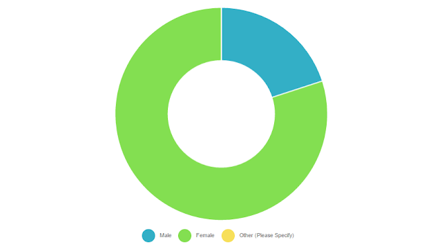
Question 2- What is your gender?


Most of the participants were female. Only 20% were male. This might suggest that I might be aiming my media product to a predominantly female audience.

Question 3- What is your ethnicity?


The large majority of my target audience have described themselves as white/Caucasian. As an ethnic majority group in the UK, this is unsurprising. This might suggest that my audience would relate less to a short film with issues surrounding race and discrimination.

Question 4- What is the highest qualification you have achieved?


Most people who completed this survey have achieved at least an AS level. Considering the main age group is 16 to 24, it might also suggest that they are still in education and hope to attain A levels or further. This suggests that my audience are fairly educated and intellectual.

Question 5- Where do you live?


Most of the participants live in and around Banstead, and very few live outside of Surrey. This might suggest that my target audience is local.


Question 6- What is your preferred social media?


The survey participants chose Facebook and Instagram together as their most preferred social media, followed closely by Twitter. These three social media platforms may be where I can find my target audience most successfully. Those who selected 'other' all put snapchat as their preferred social media.

Question 7- To what extent would you say you were film literate?


Most of the participants would call themselves somewhat film literate, if not more so. This suggests that I will be able to employ technical codes to create macro meaning to be inferred.

Question 8- Have you ever watched a short film?


Only two participants said that they have never watched a short film. This means that my target audience are familiar with the short form and will understand my final media product.

Question 9- What is your preferred genre of short?


The majority of participants said that comedy was their favourite genre of short was comedy, followed by social realism. This has given me an idea of the type of genre of short film that would be best received by my target audience.

Question 10- How many short films do you watch each month?


Most of my target audience watch 1-3 short films every month. This might suggest they only watch the well known ones that go 'viral'. However, it is not completely unlikely that they'll see my finished media product.


Question 11- Which service do you use most frequently?


The large majority of participants chose YouTube as their preferred media consumption platform. This might suggest that my target audience are better reached on YouTube compared to Vimeo, for example.

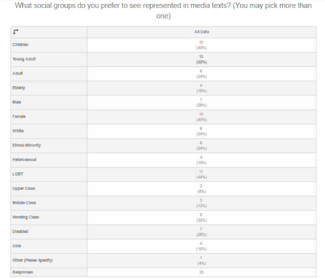
Question 12- What social groups do you prefer to see represented in media texts?


The most popular answer from each social type was: young adult, female, white/ethnic minority, LGBT, working class, and disabled. This suggests that my target audience agrees with the social realism convention of representing those that are commonly underrepresented in regular media texts.

Question 13- What issues do you like to see being represented in media texts?


The most popular answer for this question was crime, followed by sexuality, followed by discrimination and gender. This gives me a good idea of what my target audience is looking for in a short film.

To Conclude:

Overall, my target audience is fairly educated and intellectual inside and outside of the film industry. It is comprised of mainly young adults aged 16-24, whom live locally to Banstead. It is mostly white females that are likely to use either Facebook, Instagram or Twitter as their favoured social media. They sometimes watch short films and look for minority social groups being represented, as well as issues that include crime, sexuality, and discrimination.

To compare my predictions with the actual responses:
  • the majority of responses suggest that my target audience have completed AS levels or higher
  • most do fall into the 16 to 24 age group
  • most also do prefer to use Facebook or Twitter 
  • the majority of my target audience also prefer Instagram
  • most of the participants would like to see young adults being represented in media texts
  • the majority of responses do imply that my target audience is somewhat to completely film literate

Wednesday, 5 October 2016

Synopsis Draft One

Home time at a local Surrey primary school on a bright, winter's day. A young girl bursts out of the doors of her classroom and runs into her mother's arms. Her face lights up as she is handed a piece of paper with her daughter's masterpiece scrawled across one side. The pair walk across the playground and make their way back home, whilst happily chatting with one another about their days. As soon as the mother and daughter's house is in sight, the girl runs towards the front door and impatiently stands on the doormat in wait for it to open. Her mother scrambles through her bag in search for the keys, whilst her daughter loses her focus on getting inside and begins to wander around the front drive. She glances at the car and creeps behind it slowly, keeping her eyes fixed on her mother through the window, who continues to get her keys out of her bag. The girl's gaze wonders from her mother to her reflection in the car. She stares for a short while, and watches as she walks along the length of the two doors. Suddenly, her mother is at the door asking what she is doing. She replies to her in a carefree tone and walks through the door into the warm.