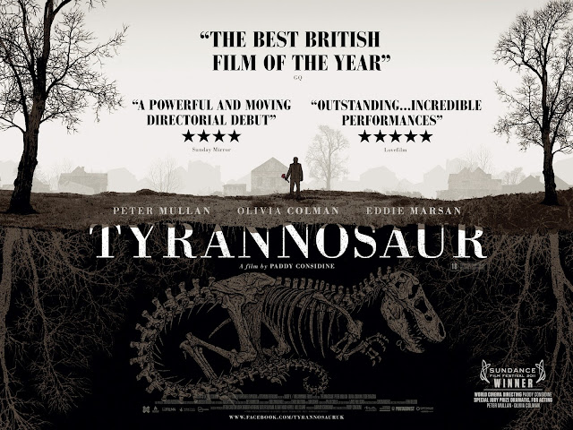
The main focus of the poster is the illustration, which predominantly shows a dinosaur buried underground. Above it, is a man holding some sort of weapon. Connotations carried might include history, past issues resurfacing and death, as well as violence and destruction. The variance of colours is low, with a neutral colour palette being used. Deeper colours, particularly brown, may be associated with cold and dark connotations. This might further support the suggested issue of death, and set up a bleak mood for the film.
The divided shape to the poster that has used in this poster two divide the living and the dead might suggest binary opposition within the film. It also carries the aforementioned connotations in a simple, yet contrasting way.
The text for the poster fills the negative spaces left by the illustration, especially with the reviews, as they formulate a triangle shape around the houses and trees. This shows that thought has been given to leaving enough room for the other conventions needed for it. The title takes up the largest part of the poster, going across the middle, making it clear in its aim to present the film to the audience. A similar font is used for the reviews and the credits, which makes the poster look neater and less cluttered, also in the way that similar colours have been used to match the illustration in the background, keeping in the same colour palette. Meanwhile, intermedial reference is made in the laurel leaf image in the bottom right hand corner, in that the poster has been created to show that it has won an award at the Sundance Film Festival. Also in the bottom is the billing block, which cannot be read clearly by just looking at the poster at this size, which is a positive aspect of the poster, because it emphasises the larger credits, such as the actors and director.
The font itself is fairly basic in that a similar serif typeface might be found on several computer programmes as one of the default fonts. This however, might be effective in creating a more serious tone to the film's poster, and therefore maintaining the correct mood considering the content.
The reviews use a dark, and bold font to clearly state the thoughts of several different magazines and newspaper film reviewers. The mention of the media text it has come from employs a wider media context for the audience to understand. The star ratings are displayed, which is a common convention of posters, and is easy to read for all types of audience, as a simple 'out-of-five' mark gives a good idea of general opinion of the film. The star rating for the top review has not been included, but instead has been made bigger and bolder than the other two. The adjective 'best' used in the review might suggest the highest rating for it, and also gives the poster an easy to read quote to place at the top of their reviews, possibly to draw in an audience.
There is a tag line missing from the poster, which might suggest the context of it. It also includes the festival award laurel leaves, and so it might imply that this is not the first version of the poster, and that it has circulated several festivals before re-releasing another poster specifying its accomplishments. Given the dimensions of this poster, it looks as if it was designed for a billboard or other types of wall hanging or advertisement, as opposed to a page in a magazine for example.

No comments:
Post a Comment